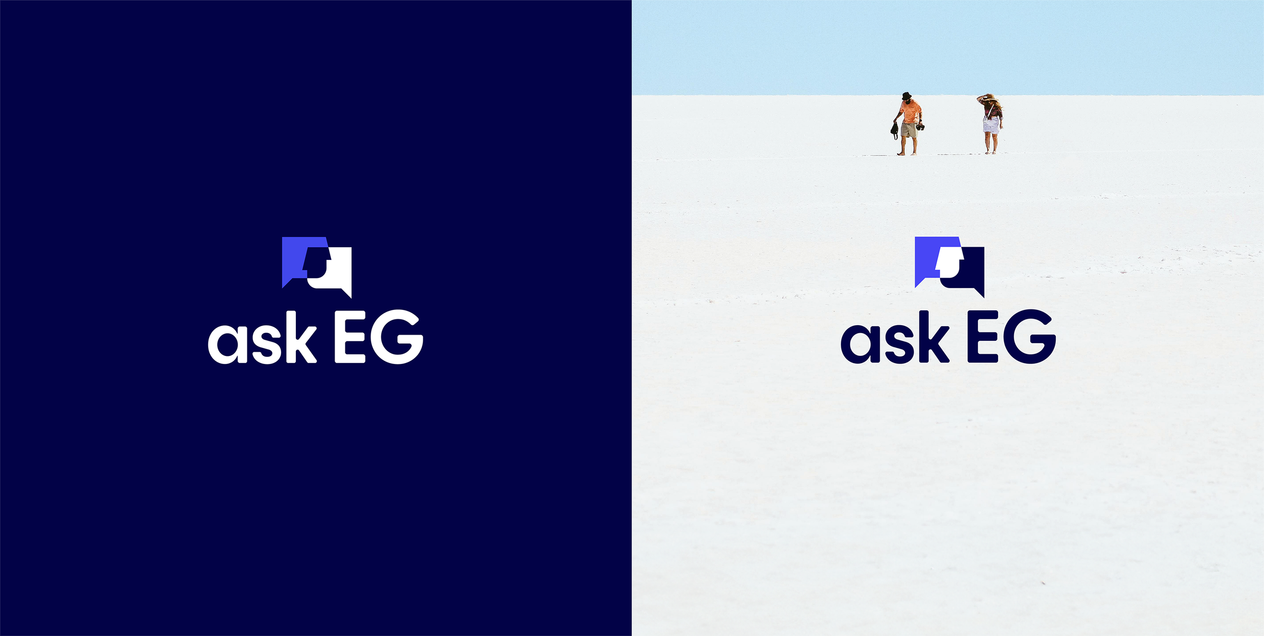
Angella-Watterson_askEG_cover_2.png

askEG

Identity design / Mockups / UI & front end web

Identity design / Mockups / UI & front end web

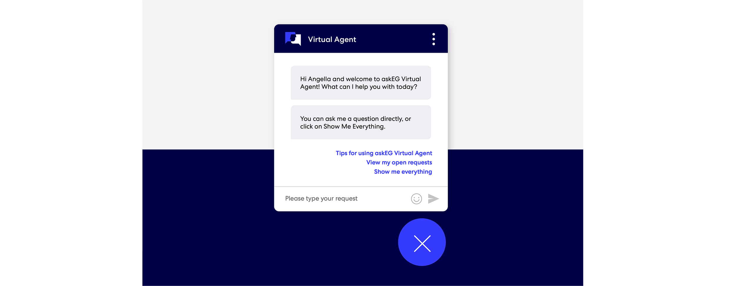
Expedia Group was on a mission to simplify their ecosystem and unite many of the big boulder programs under "One EG". ​​​​​​​Before askEG, employees had to navigate to the People Hub to contact HR and then go over to Service & Support to reach IT. Now the askEG site combines all the support needs into one hub with a Virtual Agent chat solution so that employees can get their questions answered in one location.

I designed the wordmark, visual identity, digital assets such as banners, app design and the homepage.

The wordmark is normally stacked and offered in two color ways so that it's accessible against a dark or light background

The wordmark is normally stacked and offered in two color ways so that it's accessible against a dark or light background

Angella-Watterson_askEG_wordmark_concept.png
The intersection of where the talk bubbles overlap is important because it represents askEG's new unified location for Tech Support, Facilities and HR

The intersection of where the talk bubbles overlap is important because it represents askEG's new unified location for Tech Support, Facilities and HR

Angella-Watterson_askEG_wordmark_guidance_1.png
This graphic device (taken from the icon) can be used to frame a photo. All photos must be related to askEG (ex: Health and Wellness benefits)

This graphic device (taken from the icon) can be used to frame a photo. All photos must be related to askEG (ex: Health and Wellness benefits)

Photo credit: Thirdman and Tima Miroshnichenko

Email banners and a Slack graphic

Email banners and a Slack graphic

Angella-Watterson_askEG_splashScreens.png
Angella-Watterson_askEG_app_1.png
While desktop is still the top used device for askEG, I made some options for a splash screen and an app design which uses cards to show clear, actionable content

While desktop is still the top used device for askEG, I made some options for a splash screen and an app design which uses cards to show clear, actionable content

 For the (desktop) homepage mockup, I placed the most-clicked-on modules above the fold. Over 95% of employees visit askEG on their desktop. Knowing that over 14K employees will visit this site and many are frantically seeking IT support, I kept the

For the (desktop) homepage mockup, I placed the most-clicked-on modules above the fold. Over 95% of employees visit askEG on their desktop. Knowing that over 14K employees will visit this site and many are frantically seeking IT support, I kept the layout easy to navigate with “Software Support” being one of the first buttons you see.

I intentionally made the search bar button and virtual chat bubble in EG’s secondary color, Pacific Blue, to make those two features pop. According to our data, the search bar is used the most by our employees followed by “Popular Topics”. IT was also trying to promote the new chat feature which remains fixed in the lower right corner while you’re scrolling.

My design recommendation for how the chat bubble should look

My design recommendation for how the chat bubble should look